
Your visual material sucks.
This is a bold statement, but most probably a true one. Many people struggle with creating visual material, and whether it’s a presentation, a poster or a project assignment, badly designed visual material can obstruct your message and frustrate your audience.
But don’t worry, in this article we will go through 3 simple principles that will help you to create better visual material.
A quick side note: Every design process should start by defining the purpose, the context and the audience of your material. If you don’t know why and for whom you are creating your material, you won’t produce the right thing. Purpose, context and audience has to guide your whole design process.
1. Hierarchy
A good hierarchy establishes an order of importance within the material. It helps your audience to navigate the material and extract relevant information.
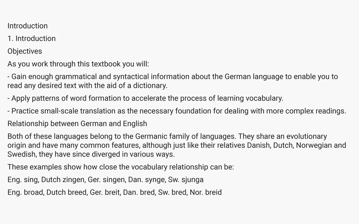
Let’s look at an example.
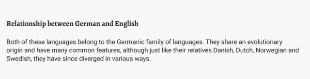
The piece below is an excerpt from ”A Foundation Course in Reading German“ by Howard Martin. Without a visual hierarchy, titles, objectives and content create one big wall of inaccessible text, making it difficult to understand the underlying information.
This is an extreme example, for sure, and not something you would find often. But notice how a clear visual hierarchy makes this text much more accessible to the audience:
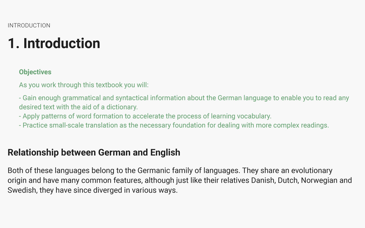
A clear hierarchy in the text allows users to understand the function and content of each section easily and enables them to isolate certain information based on its styling. Prospective students could now quickly skim the objectives to decide whether the workbook matches their learning goals.
Creating visual hierarchy
There are a few basic methods to create visual hierarchy:
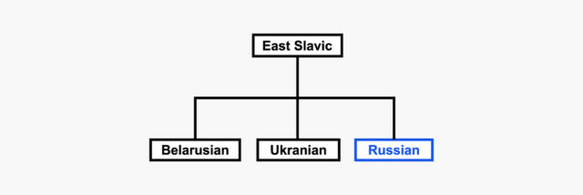
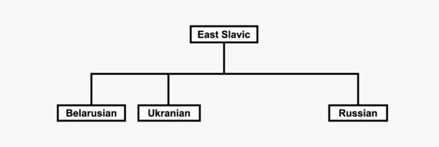
Size
One of the easiest ways to create hierarchy. Large elements (text, images, etc.) catch the eye first.
Color
Again an easy way to signify different levels of importance. However, you should avoid relying solely on color to indicate differences. Not only can this cause problems with printed material (think of your black-and-white only office printers), but keep in mind that about 10% of males and 1% of females have some form of color blindness, and thus cannot perceive color or color differences.
Placement
Placement relates to the placement of elements within a layout and the position of those elements in relationship to each other. The law of proximity states that ”objects or shapes that are close to one another appear to form groups“ (en.wikipedia.org/wiki/Principles_of_grouping), thus creating distinct, related sections. For text especially, this means that line and paragraph spacing have a significant impact on creating hierarchy.

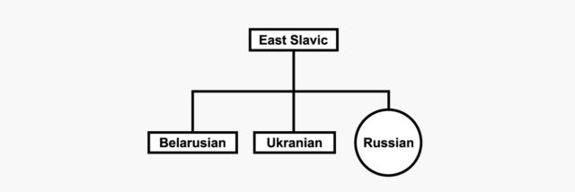
Shape
For text based material especially, using contrasting fonts (i.e. fonts whose letter shapes differ clearly) can help to establish an order of importance.
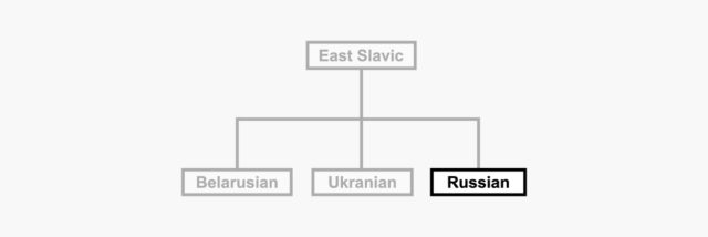
Combination
In most cases you should use a combination of the above mentioned methods. Which and how many depends on your particular material and audience.
As we have seen in this section, to create an effective hierarchy, the various elements of your material need to be sufficiently different from each other. This leads us to the next point:
2. Contrast
Contrast focuses the attention of the audience. Applying contrast helps to highlight and emphasize important information.
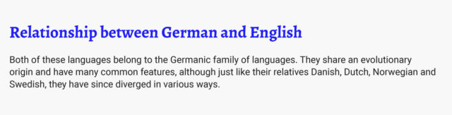
The following example shows how contrast can be used to lead the attention of the audience to relevant information, while at the same time de-highlighting secondary elements.

Without contrast. (Photos by Alexis Brown on Unsplash)
With contrast
Contrast is an extremely powerful tool, and can be used for any type of visual material – posters, videos, websites, paintings and many more.
Creating contrast
Again, these methods can help to create contrast:
Size
Color
See the notes on using color in the previous section.
Placement
Shape
De-highlighting
Rather than adding more elements, one of the easiest ways to effectively highlight important information is to remove or de-highlight irrelevant information.
A word of warning: Be careful when highlighting information. As with its physical counterpart, highlighting too many areas can lead to the opposite of the desired effect.

Source: medium.com/@julia.tincombe/cramming-101-how-to-study-smart-d9edfc0d0d74
3. Consistency
As powerful as hierarchy and contrast are as visual principles, neither can work if not used in combination with consistency.
Consistency unifies your material. It ties together elements with the same function and gives a coherent & professional look. Using colors, fonts, imagery and positioning consistently helps the audience orient themselves and extract information quickly.
Looking at the following example, you will notice how you need to mentally re-orient yourself on each of the three cards before being able to take in their content. Using different text styles, positioning and picture styles obscures the fact that they essentially present the same type of information, and makes it hard to compare them.
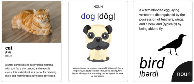
Cat by Michael Sum on Unsplash, openclipart.org/detail/306091/cartoon-dog-portrait, openclipart.org/detail/287943/bird-silhouette
Compare this with the following example. Instead of using the majority of your mental capacities for reorienting yourself in the material, you could now use if for more important and relevant tasks. In this specific example, understanding the difference between a cat, a dog and a bird.
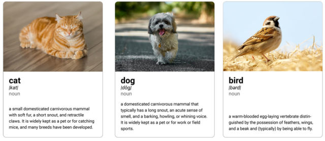
Cat by Michael Sum on Unsplash, Dog by Nikolay Tchaouchev on Unsplash, Bird by Mathew Schwartz on Unsplash
Not only does it reduce cognitive load, creating consistent visual material can also increase efficiency (e.g. having buttons on a website look and function the same way allows users to navigate quicker) and support recognition (e.g. the consistent use of a certain shade of red makes Coca-Cola cans easily recognizable).
To sum up:
“Things that are the same should look the same. Things that look different should actually be different.” – Matthew Butterick, Typography for Laywers
Recap
Each of the three principles in this article is highly effective on its own, and they become even more powerful when used in combination. As I mentioned before, the purpose and audience of your material should always be the guiding ideas behind all your design choices, but asking yourself the following questions can make the difference between confusion and clarity.
So ask yourself:
- Hierarchy: Do I establish an order of importance?
- Contrast: Do I lead the focus to the important points?
- Consistency: Do same elements look the same?
I promise, that keeping hierarchy, contrast and consistency in mind, you will create visual material that wows your audience and communicates your message efficiently.
Further readings:
- Understanding Typographic Hierarchy
- The Non-Designer’s Design Book by Robin Patricia Williams
- Better Presentations : A Guide for Scholars, Researchers, and Wonks by Jonathan Schwabish